I used to think that for a image to have strong contrast, the histogram needs to looks like this:
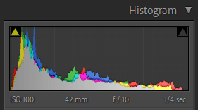
That is, good portions of pixels must inhabit both the black and the white zones. But images like this have changed my mind:
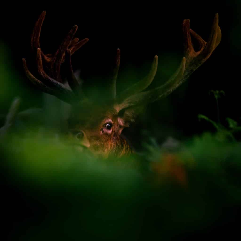
Here the blacks are dark (solid black, in fact) but the brightest portions of this image – the white of his eye – is only at about 70% brightness. In short, I’ve started thinking about contrast in much more relative terms. An element in the high-midtones can look like pure white if a good portion of the rest of the image is really dark.
For any given colour, the brighter it is, the less saturated it will appear. Bright, ethereal images can give a great effect and I use this often – especially when the scene lends itself to a pastel palette. Low-key, darker images are by the same token likely to be more saturated and this opens up other options to create impact. This saturation allows you to play with colour harmony to tell your story. In the image above, I played on the colours that were there already there and – using split toning – I emphasised pleasing red and green complimentary colours to make the image more harmonious.
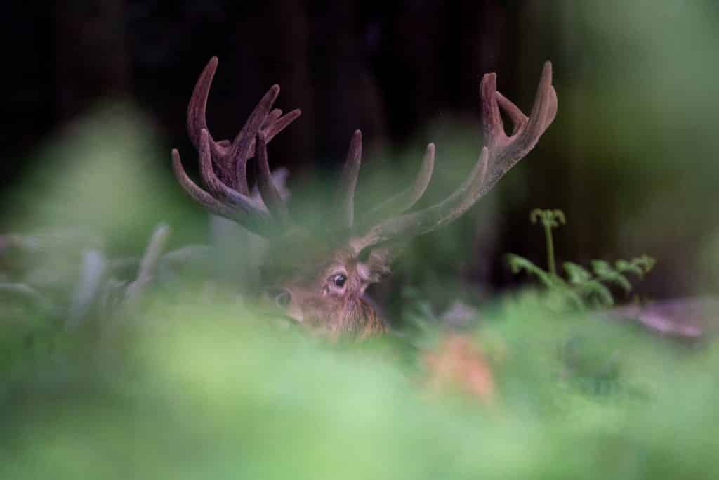
Back when I took the shot in 2019, I took a totally different approach. I lifted the shadows and made everything more explicit. (I was also going through a stage of using presets in Color Efex Pro which didn’t help any with subtlety.) The original edit lacks all the mood and wonder that you experience when you encounter deer in the woods (and, yes, you even feel this when you come across a rutting stag in a popular deer park!)
When you are taking and – perhaps especially – when you are editing a photo, you need to ask yourself, ‘What do I want the viewer to look at?’ I wasn’t considering this question deeply enough until very recently. The relative impact that a certain luminosity value can have – depending where it is situated and what is around it – is just another tool to tell a better story; another way to bring a viewers attention where you wish it to be.
